Web Design & Development
Reinforce your brand & meet your business goals
As a web design and SEO company, we are passionate about developing fully responsive, user-friendly and SEO-optimised websites that promote your business, reinforce your brand and meet your business goals.
We take the time to fully understand your business so that we can design a website that is targeted to you. Our web design and development services help you stand out from your competitors and convert visitors into customers.
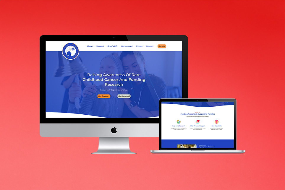
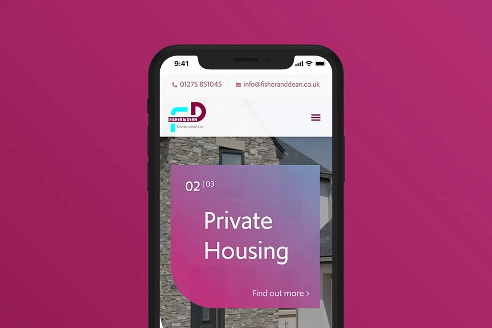
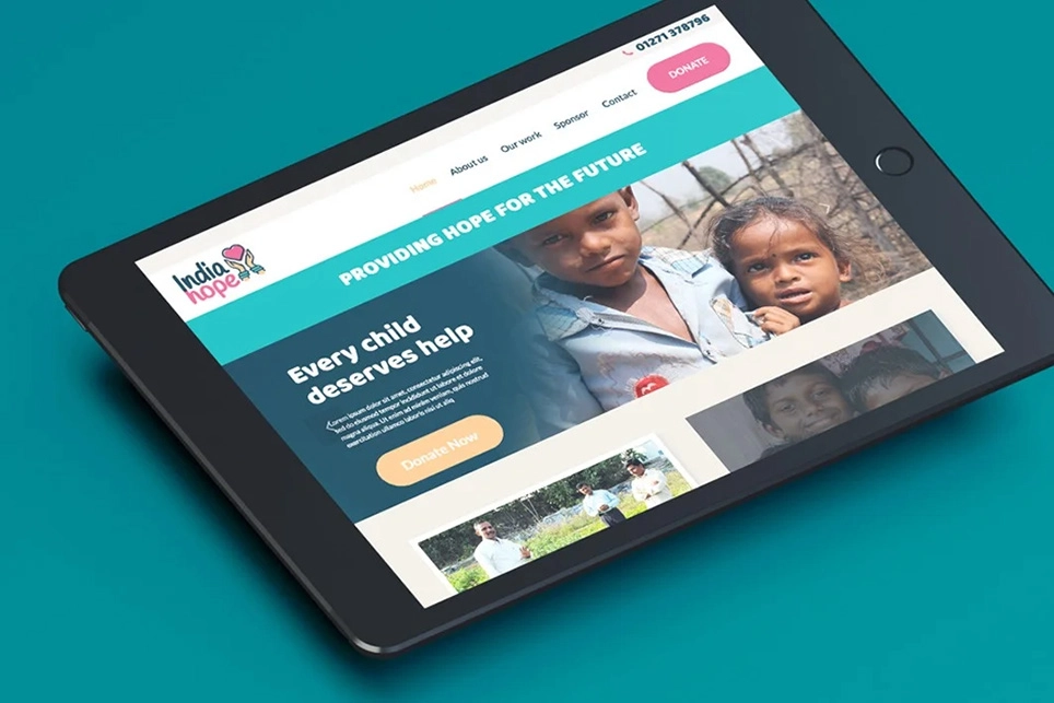
Mobile-Friendly Responsiveness
We deliver mobile-friendly, SEO-optimised websites. Our websites work professionally across all devices such as phones, tablets, laptops and PCs.
Did you know?
- 60% of web traffic comes from mobile devices
- Responsive web design improves SEO rankings
- Accessible websites boost credibility
Your Website is Your Shop Window
If you have a well-maintained, attractive shop front, customers are more likely to buy your products or services. By updating your website, you could benefit from:
- Boosted SEO rankings
- Increased traffic and brand awareness
- Improved sales
- Increased numbers of returning visitors
If you’re looking for a new website, please get in touch and we will work with you to design your perfect solution.
User Experience
The core element of website design is the user experience. We build websites with user experience in mind.
We monitor user interactions on your existing website, so we can research who your customers are, where your customers go and what your customers need from your website.
Once we understand your clients, our web designer can create a website prototype and test with real information to fine-tune it. Satisfied customers who have a positive experience on your website lead to increased conversions.
E-commerce Website Design & Development
Are you looking to sell your products and services online? E-commerce provides an opportunity to sell your goods and services online without restrictions of time or geography. We develop bespoke websites that are optimised for customer sales conversions.
WordPress Website & Theme Development
We develop most of our websites using WordPress. Our WordPress web development services include designing a custom theme for your website that aligns with your branding.
Using WordPress, the most popular and accessible content management system, you, and your team can quickly and easily edit and manage your website, edit text, images, links and metadata as often as you like.
Website Hosting, Domain Names & SSL Certificates
Not only do we design your website, but we can also host it. All our servers use the latest technology and are backed up and monitored.
All our websites come with an SSL certificate as standard. An SSL certificate provides security as well as reassurance to your site visitors and customers by ensuring you are protecting their data.